Project overview
Our team undertook an open-ended project that involved the creation of an operating system and 15 native apps. Throughout this endeavor, we engaged in extensive brainstorming sessions and conducted thorough research to develop a project that we are so proud of.
Timeline: 11 weeks (Fall 2021)
Project Type: Class Project (INFO 365: Mobile Application Design)
Team: Anna Shi, Delaney Edwards, Rachel Chung, Emily Dooley, Nicole Fendi, Larry Tian & I
Programs Used: Figma, Pitch
My Role: UX Designer, UI Designer
Methods: Interaction Design, User Research
Context
The first thing my professor said to us when walking into class was:
“You have 10 weeks to design a mobile operating system along with 15 native apps. In the end, we’ll have industry designers review your work and rate it out of 5 stars, the same as in the app store. Best of luck!” (Brian Fling, my professor) ”
Then through awkward eye contact and smiles, I was paired with my team for the quarter. Six incredible people are designers. We all had different backgrounds and design skills, but we had a mutual goal: designing our OS with intent.
Brainstorming
We began our project with extensive discussions and brainstorming sessions to identify potential problems to solve. Ultimately, we all felt passionate about the fact that we were spending too much time on our phones and being easily distracted from being productive. This inspired us to develop an idea focused on addressing this issue and improving overall productivity.
“I wish my phone wasn’t such a distraction… what if we design a phone that is meant to be used less?”
Background Research
Subsequently, we conducted thorough research to gain a better understanding of current user behavior patterns and trends.
89%
of phone users use their phones during social gatherings
43%
of Americans constantly check their phones every 6 mins
89%
of constant checkers worry about their mental and physical health
Market Research
Some existing solutions on the market include:
Limited phone usage settings
Gamified reward systems for positive phone behavior
Features that enable users to disconnect and focus on other activities
However, while there are many options available, few have been widely adopted or proven to be effective in the long term. This insight informed our approach to developing a unique solution that addresses the root causes of phone addiction and encourages users to cultivate healthy habits.
Defining the Problem Space
Target Demographic:
Design Requirements
From the research we conducted, we understood that although users wanted to be less on their phones, they needed their phones to maintain their productivity. To keep our user’s needs in mind while designing we came up with a list of design requirements that will guide us through our design process.
With these principles in mind, we created a mood board as a visual tool to establish and communicate the desired look, feel, and emotional tone of the product. This helped us align our shared vision, inspire creativity, and streamline decision-making.
The Physical Product
After a long brainstorming session, we decided to design our OS on a Samsung flip phone. This is so that the action of closing the phone physically separates the user from the technology allowing them to fully live in the moment.
Low Fidelity Prototype
Style Guide
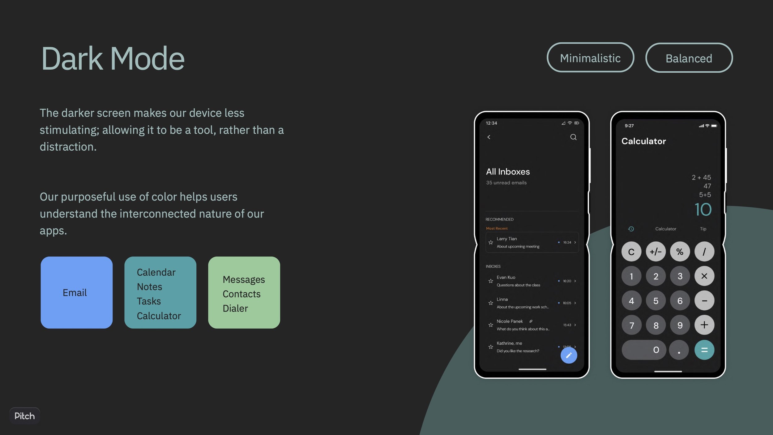
We chose to design our OS in dark mode. From our research, we found that dark mode reduces eye strain, conserves battery life, and creates a more focused user experience. To reinforce the seamless experience of our operating system, we decided to use color coordination across interconnected apps, which would serve as visual cues for users to build mental associations between them. This approach helps users to navigate effortlessly between apps and reinforces the streamlined nature of our system.
Our Design Components:
Our Final Design:


How did our OS solve the problem?
During the development of this operating system, we made sure that each and every design choice was supported by thorough research and followed established UX protocols. We dedicated extensive time to discussing even the smallest details. Reflecting upon this project, we find that many of our features have been incorporated into the latest version of Apple iOS and other products.
User validation
Once we completed our prototype we showed our OS to many people in our community, including individuals from the design industry. We got great feedback, and many wished their phones had our features implemented. We hope to test our prototype with more user research in our next steps.
Reflection:
Results:
After completing our project, we submitted it to a panel of industry designers for evaluation. Similar to how apps receive ratings in the app store, our project was rated on a scale of 1 to 5 stars. We are proud to share that our team received the highest rating, 5 stars, in the class.
Takeaways:
During the project, I gained valuable insights into teamwork and design principles. I realized the significance of having trust and harmony with my teammates, which allowed us to work effectively together. We also honed our skills for maintaining consistency throughout the design process. Moreover, I learned how to support and justify our design decisions using research and design principles. Collaborating with my teammates was a great learning experience, and we all benefited from each other's expertise and passion for UX. We really fed off each other's passion to create a project we were all very proud of.
“Finding a good design group is like falling in love”
- Professor Nam-ho Park.
Featuring: My amazing design team


